Over the years, Microsoft has evolved Windows into a very mature Operating System. I've found Windows 7 pretty stable and many people agree with that. However one thing I feel Microsoft hasn't got it right is the default window decoration.
Take a look at the two Command Prompt windows overlapping each other:
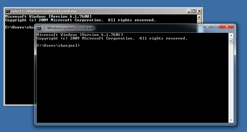
The one in the rear is using Classic Windows decoration which is similar to that of Windows 2000. The one in the foreground is using the new Window decoration introduced in Vista and is considered to be better by Microsoft and hence set as the default one. It also uses Aero effects to reflect state of background windows into current's top bar and borders.
Most people find the former a bit boring but at the same time less distracting, simpler, visually easy to follow and hence practically better in terms of user experience.
The latter adds some bells and whistles by extra colors, more shades, thicker and blended colored borders, semi transparent windows.
Now let's analyze the two:
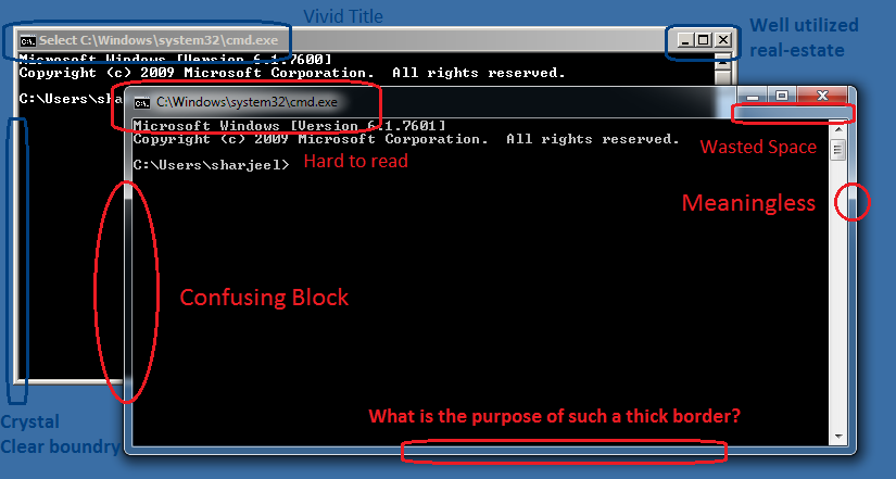
Clearly, the new interface has many extra things which are not part of the content of the Window but are added just as "effects". However they require cognitive efforts to separate from the actual meaningful content.
In 99.9% of the cases I really don't want to see through my current windows to look at the blurred view of the Windows underneath; it just required my brain's processing power to figure out the current window's contents and separate them from the window underneath. Also, such a thick border doesn't contribute into anything positive in terms of User Experience.
On the other hand, let us compare equal sized windows of Windows Messenger and Google Talk. Windows Messenger uses default window decoration while Google Talk uses a much much simpler user interface.
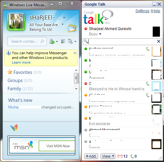
Here, Windows Messenger is not showing me a single meaningful thing in terms of an Instant Messaging service. On the other hand, with the same window size, Google Talk is delivering everything: my online friends, away friends, statuses, search box, unread emails. I can instantly click on a friend and start chatting. I can't do that in Windows Messenger without resizing the Window to something much bigger. That is because not much thoughts have been given to space utilization.
More is less, less is more. I hope Windows UX/UI teams will try to utilize every pixel into something rather than just bloating up everything.